


- Clearance first: make sure there’s comfortable cue space around the table perimeter
- Paths second: keep a clean walking lane from doors to seating
- Lighting third: avoid harsh shadows or glare that cut across the table
- Then style: finalize cloth direction, accessories, and accents
While you plan, these sections help you think through layout and atmosphere
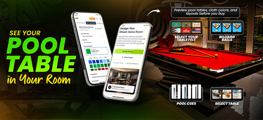
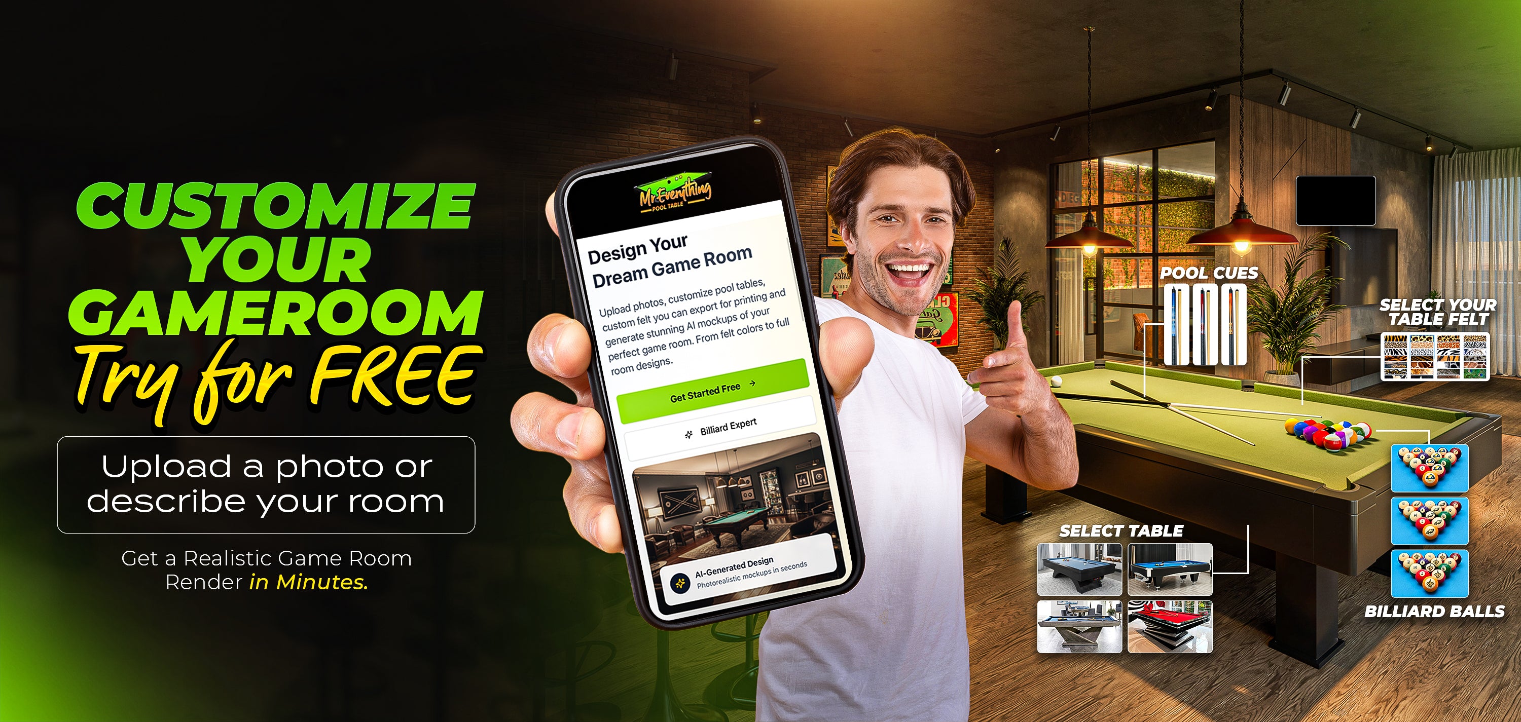
Cloth & felt: choosing visually without overthinking
Cloth is one of the highest-impact visual choices in a game room. It dominates photos, sets the room tone, and can either blend in or become the room’s signature.
Three visual directions that work in most homes:
- Classic: clean greens and tournament blues that fit almost any decor
- Modern accent: bolder colors that match a wall, rug, or lighting tone
- Signature: custom or logo-based designs that become the centerpiece
Cloth categories to browse while you explore:
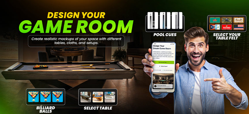
A room looks professionally designed when the details match the direction. The Studio becomes more useful when you build the “details layer” after you decide the table footprint and cloth direction.
- Choose one dominant tone
- Choose one accent tone
- Choose one signature detail (team theme, custom logo, or standout cloth)
Useful categories while you refine the details:
- Cue sticks & racks
- NFL cues
- NHL cues
- NCAA corner cue rack
- Billiard balls
- NFL billiard balls
- NFL triangle + cue + ball sets:
- Pockets
- Pool table covers
- Team pool table covers
- NFL pool table covers
- NCAA pool table covers
Lighting is not just decor—it changes how cloth color reads and how your room photographs. A room can feel “premium” with the right lighting even before you add extra décor.
- Even coverage: avoid hotspots or harsh glare
- Consistent tone: warm vs cool bulbs can change cloth appearance
- Room balance: include secondary lighting so the table isn’t the only bright area
Lighting categories to reference:
MAINTENANCE